I’d never taken the time to analyze these logos before, but now that I’ve done it I’ll never see these brands in the same way in my life.
Have you ever stopped to look closely at these logos?
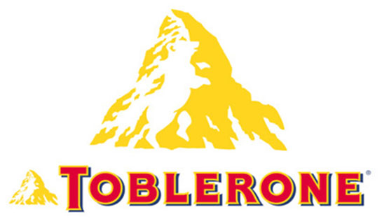
Toblerone
 Google.
Wihtout a doubt, this is one of the best and most complete logos in this list. Probably you see it and think: it's just a mountain, right? Well the truth is that, if you look look closer, you can see a bear... There's a bear in the space inside the mountain, and it symbolizes the town of Bern, in Switzerland.
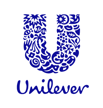
Unilever
 Google.
Unilever is a huge company of drinks, soft drinks, food, cleaning products and personal care. They produce a great quantity of products and wanted to reflect it all in its logo. We can spend a long time looking for meanings inside the "u".
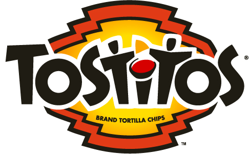
Tostitos
 Google.
One of our favorites for its simplicity and creativity. Surely you never saw anything beyond the name of the brand, but if you focus and analyze it you'll see on it two people enjoying some chips and salsa. It's subtle and makes you hungy when you see it.
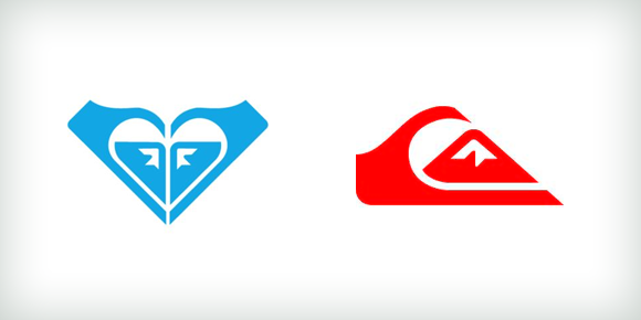
Roxy and Quicksilver
 Google.
Roxy is a brand of women's swimsuits and clothes owned by Quicksilver, which is a famous brand of male swimswear and surfwear. Roxy's logo is formed by uniting two Quicksilver logos to make the shape of a heart. Nice!
Facebook Places
 Google.
Facebook Places allows us to share with our friends the location where we are, see where they are and discover new sites. If you look at the logo, you can see that there's a 4 in the "square". A wink at Foursquare?
Sony Vaio
 Google.
Sony was already one of the first and most popular technology brands, and then they decided to create a more virtual and innovative proposal: Sony Vaio. The logo symbolizes the union of digital and analog technology. The "VA" forms an analog wave and the "IO" represents the binary code of 0 and 1.
FedEx
 Google.
This case is well known, but for if you don’t know it, you'll find it curious. Between the "E" and the "x" is a blank space in which you can clearly see an arrow placed there to transmit subliminally speed and precision. Now that we've told you, you'll sure start seeing the arrow whenever you see the logo.
Amazon
 Google.
Amazon is one of the most famous and used online stores in history, and now we reveal a very curious fact about its logo. The yellow curved arrow looks like a smile: Amazon.com wants to have happy customers. They are telling us: we have the best service possible, and also want us to know that their store has everything from A to Z.
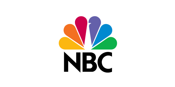
NBC
 Google.
It's the first time I notice something super curious about the logo of this famous TV company. I always thought it was a shell or colorful drops, but no, really if you look closer you'll find the truth: it's a peacock . Have you ever noticed the logo hides a peacock? That's why it's so colorful!
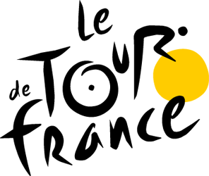
The Tour of France
 Google.
The Tour of France is one of the most prestigious and famous cycling competitions in the world, and it's played throughout France. There is a cyclist in the logo, if you take a closer look, the Yellow circle is a wheel.
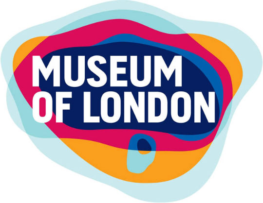
Museum of London
 Pinterest.
The Museum of London documents the history of London from prehistoric times up to the present day. The museum is near to Barbican centre, as part of the showy complex of buildings. It looks like a colorful logo, no? Well, the design represents the growth throughout time of the geographical area of London.
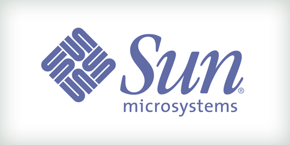
Sun microsystems
 Google.
When it’s about intelligence and creativity, this logo is always used as example. It's simple but meets the intention . This logo was created by teacher Vaughan Pratt of Stanford University. By using a very intelligent design, he made the name of the brand readable in any direction.
Elefont
 Google.
Not everything has to be complicated and subliminal, sometimes it's enough to have the imagination to be able to give the sense that is needed. This logo was showcases the e of elefont and with the blank space it showcases also an elephant trunk. Simple, and functional.
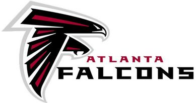
Atlanta Falcons
 Google.
If you're a sports lover, you probably already know about this one, but we're going to tell you anyways. For those who have never noticed this, the falcon has this form to represent the letter "F". Surely you had realized, but it's very interesting.
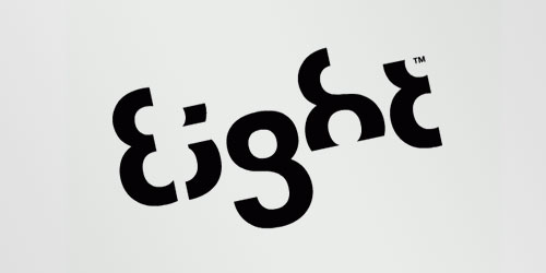
Eight
 Google.
This is one of the most complicated logos we have ever seen, it was probably very difficult to get the final design, and although many like it, experts say that it's an excessive attempt to make it unique. A very interesting concept. Each letter is made from number 8.
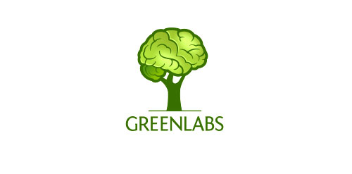
Greenlabs
 Pinterest.
An excellent mix that represents the mission and vision of the famous company. Its intention is to show that each of its workers is a great thinker. The tree represents the brain, to emphasize the strong intellectual abilities of the workers of the company.
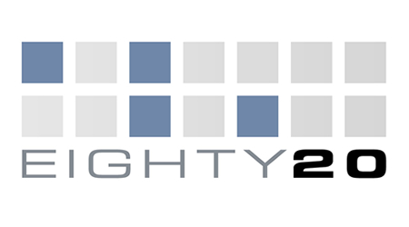
Eighty 20
 Google.
This logo was created to really make us think. When you see it for the first time it seems a very strange thing, but if you could analyze it you'll find something amazing. Eighty-20 is a small consulting firm that wants us to read in binary through their logo. We challenge you to decode it.
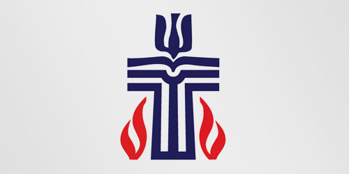
Presbyterian logo
 Pinterest.
In this one we aren't going to reveal everything, we're going to do a little mental exercise so stay focused and use your mind. It's a logo of a Presbyterian church and has many hidden messages. Do you guess what is in it? Just look a little and you can see hidden symbols, like a fish.
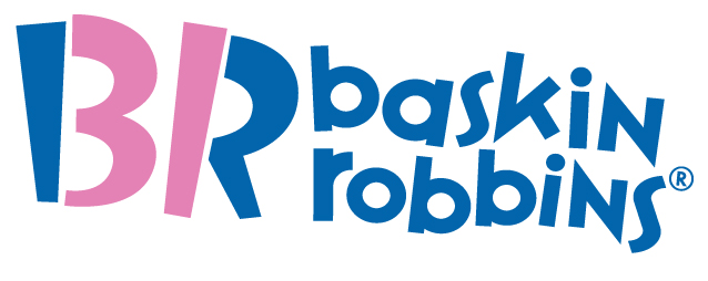
Baskin Robbins
 Google.
Baskin Robbins has 31 flavors, the pink in the BR represents the 31 and the initials of the brand in the logo. Baskin Robbins is an ice cream franchise that belongs to the Dunkin 'Brands group. The company was founded in 1953, when Burt Baskin and Irvine Robbins merged their two ice cream businesses in the city of Glendale, California.
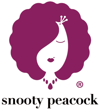
Snooty Peacock
 Google.
This is a very popular american Jewelery store, with affordable prices and great designs. This logo shows both a woman wearing jewelry and a peacock in the white space. It gives the feeling of simplicity and accessibility.