Maybe we never pay too much attention to the details of the things around us, just as these famous logos because we are so used to them that never actually ask ourselves their meaning.
Here are some logos with hidden messages we’ve never noticed before, take a look on them!
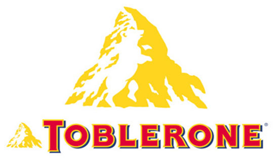
Toblerone
 Google
Founded in Bern, Switzerland, Toblerone’s are filled with spiky chocolatey goodness! But what about the logo? Bern is also known as “The City of the Bears”. Just notice the bear hiding in the mountain of their logo!
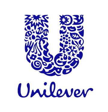
Unilever
 Google
The letter “U” in the logo is pretty self-explanatory but look closer and you’ll see it’s actually a mosaic of many little images. Every single one of these actually represents some aspect of the Unilever empire. By way of example you may be able to see a recycling symbol representing their commitment to sustainability and perhaps you can see a pair of lips that symbolizes beauty and taste.
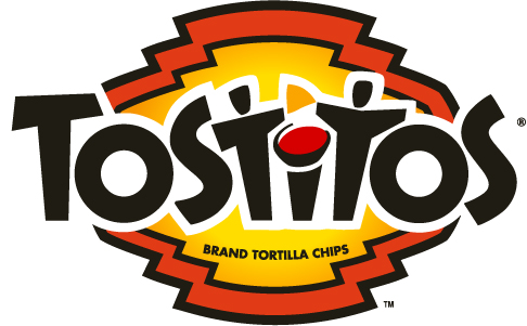
Tostitos
 Google
The letters TIT are two actually people enjoying mexican food at a table.
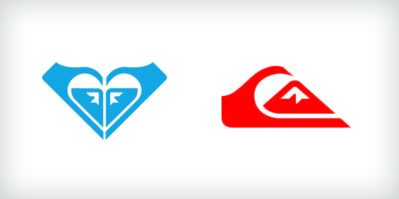
Roxy and Quiksilver
 Google
The Roxy logo consists of two copies of the Quiksilver logo, one reflected, forming a heart.
Facebook Places
 Google
It means people can tell their friends about a cool restaurant or a film that’s worth going to see, or even a good spot for a picnic.
Sony Vaio
 Google
The logo integrates the ideas of analog and digital technology into one, using the V and A to represent an analog wave, and the I and O to represent binary from the digital world.
FedEx
 Google
FedEx’s logo, specifically the arrow, is meant to act as a subliminal message for speed and precision.
Amazon
 Google
A close inspection of the Amazon logo will reveal its rather simple meaning. You will notice that the arrow serves two purposes. The first is quite simply a smile. We’ll let you guess what this means! The second is the fact that the arrow connects the letters A and Z. The message is pretty clear. With Amazon you can get any product from A to Z! Simple yet effective!
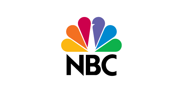
NBC
 Google
One of the more colorful company logos, NBC’s peacock has an interesting past. These 6 colors are said to represent each of the company’s departments; News, Sports, Entertainment, Stations, Networks, and Productions. The head of the peacock faces to the right to symbolize the network’s ethos of constantly looking to the future.
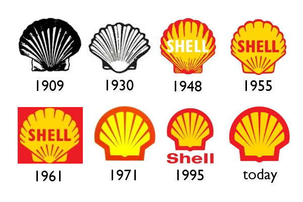
Shell
 Google
Their yellow-red Shell logo has been changed considerably over the years. The choice of a pecten or scallop shell is symbolic of the company’s self-image and ethics and is intended to extend a message of exceptional reputation and charisma. The red and yellow for the coloration may have their origins from the company’s Scottish Director in 1915. Red and yellow form the basis of the Royal Standard of Scotland.
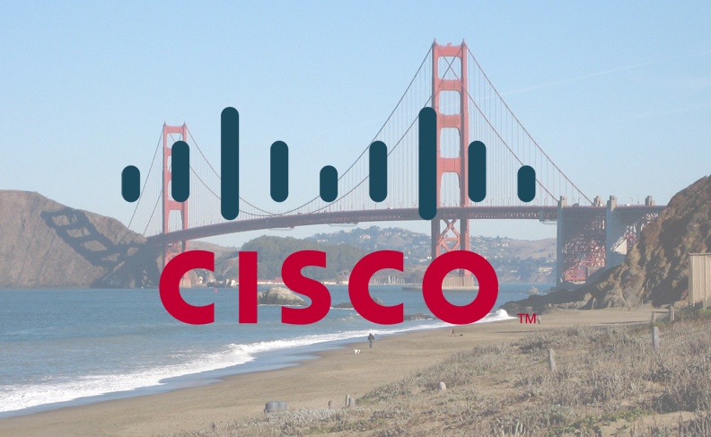
Cisco
 Google
They were founded in San Francisco, the company's name it's clear. The series of blue lines are meant to represent an electromagnet but it is also symbolic of the Golden Gate Bridge
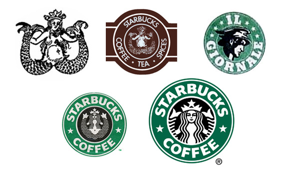
Starbucks
 Google
Ever wondered what’s actually going on with the Starbucks log0? According to Starbucks , the choice of logo goes back to their foundation in Seattle. The city has a long history of seafaring and sea trade and in 1971 the company’s founders wanted to capture this in their logo. The image has changed somewhat since the company’s early days and has seen the image cropped to its current form.
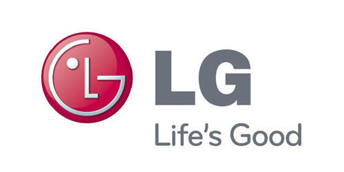
LG
 Google
The symbol mark consists of two elements: the LG logo in LG Grey and the stylized image of a human face in the unique LG Red color.
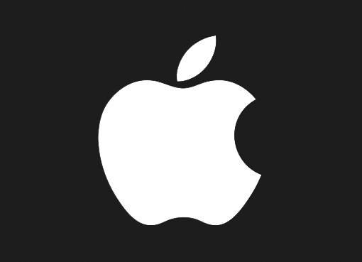
Apple
 Google
The Apple logo symbolizes the use of the computers to obtain knowledge and, ideally, enlighten the human race.
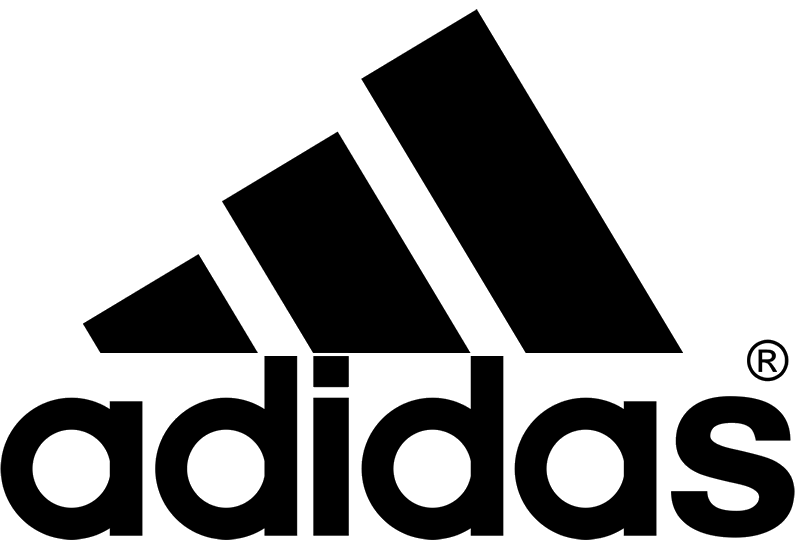
Adidas
 Google
The three stripes come from their 3 striped shoe design, but also form the shape of a mountain, which represents the challenges athletes face.
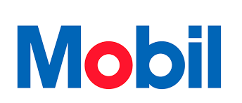
Mobil
 Google
Their current logo was designed in 1964 by the famous advertising group Chermayeff and Geismar Inc. The colors of the letters do have a meaning, of course. The red “O” stands for Mobil’s commitment and passion to its customers whereas the blue letters characterize Mobil’s reliance, trust and commitment.
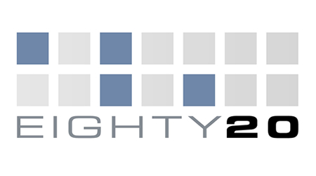
Eighty 20
 Google
Eighty 20 is a consultancy based in Cape Town, South Africa. The different colored squares actually display the binary pattern for 1010000 and 0010100. This spells eighty and twenty in binary.
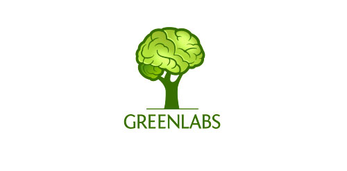
Greenlabs
 Google
Greenlabs is a web development company. the logo emphasis on the strong intellectual capabilities of the company's staff and the crown of the tree is also represents a brain.
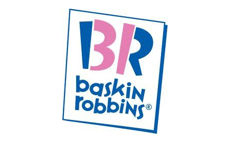
Baskin Robbins
 Google
It offers 31 flavors of ice-cream. The number 31 is hidden in the logo within the letters of B and R. The Northwest Airlines logo has two hidden meanings. For one it has the letters N and W in positive and negative
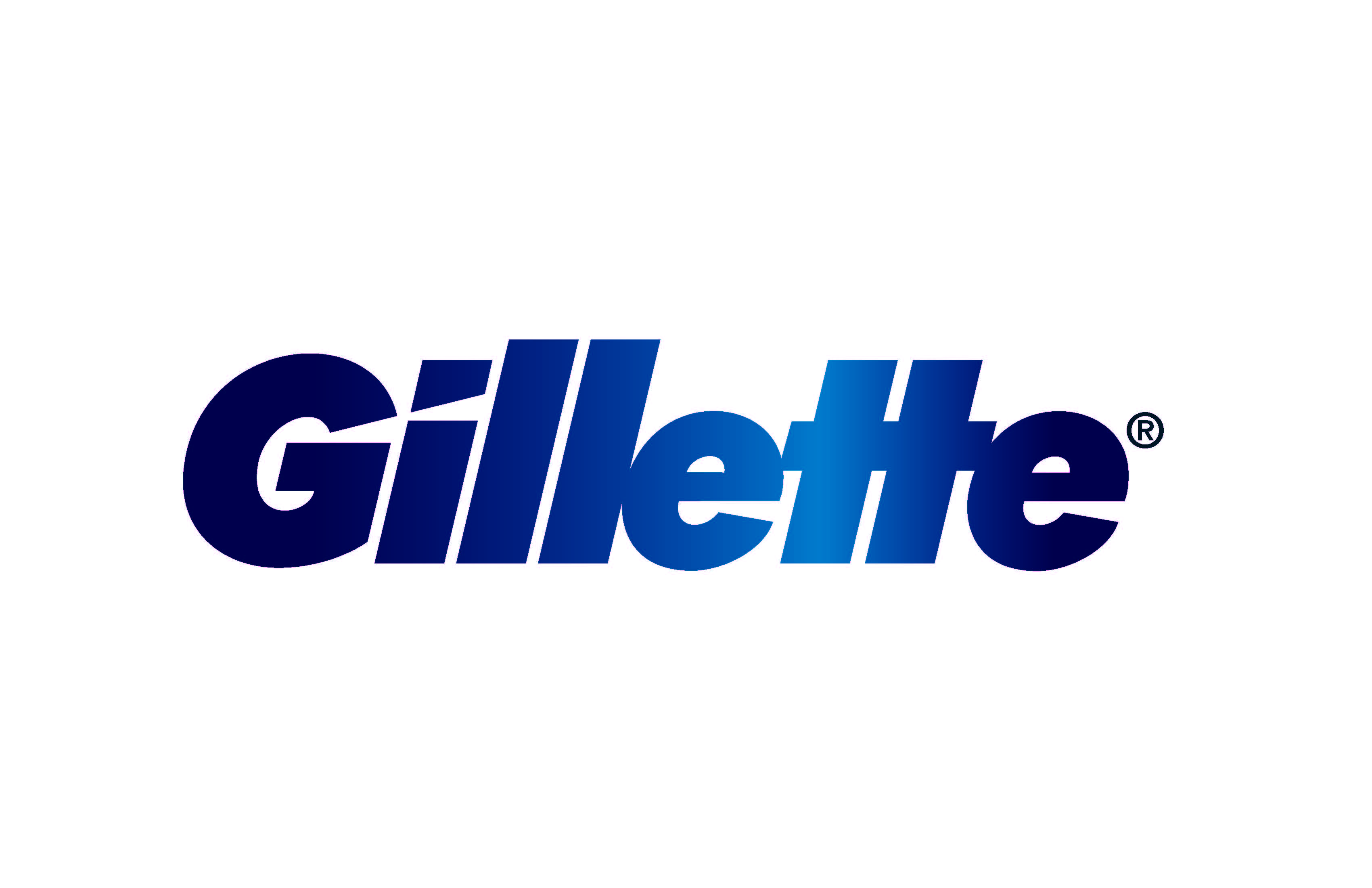
Gillette
 Google
Gilette’s logo is pretty subtle until you look closely at the logo itself. Have a look at the “G” and “I” at the beginning of the name. The design is meant to represent the sharpness and precision of their razor blade products.